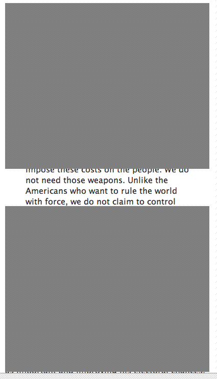
Some readers have complained that occasionally postings are partially obscured when viewed with the Firefox browser. I haven’t seen this effect in Firefox myself, so I assume it is a setting problem. Or CSS formatting conflict?
It can also occur in in I.E., apparently, and it positively does not in Safari 3.0. A reader has written in that the problem does not occur in Firefox 3.0 beta.
[The most expert opinion appears to favor upgrading your browser to the latest version, as well as emptying your cache and setting text size to normal; people say when they have done these things, the problem goes away. Apparently Apple’s new Safari browser also has the virtue of not having this problem.]
Another reader said the site does not validate well. However, I’m just using Doug Bowman’s Minima template for blogger.com, and I never have bothered to learn css, and the useful comment would be to direct me to a similar but better-validated blogger.com template.
Do any of my technically ept readers have any suggestions to fix the grey block problem in Firefox? It seems to be a user setting, since it does not occur very often. One kind reader sent a screen shot, below.


 © 2025 All Rights Reserved